
3 Simple Steps to Finishing Your Logo
I’ve got a couple logo design projects in the works and one of them is entering the final stages of production. As with most graphic designers, just about all my logo designs are produced in vector format using Adobe Illustrator. And over the years, I’ve come across vector files for logos that haven’t been completely finished. I’ve found there are three common production steps that many designers forget, or don’t know, to do.
This first one must be a regular occurrence because print vendors ask of this up front before receiving a file – “Please turn all fonts to outlines.”

If you use a font in your logo design and send the vector file to someone else, there’s a good chance they won’t have the same font. The problem with that is your font could be automatically replaced with some other generic typestyle. Maybe even Comic Sans. Yikes!
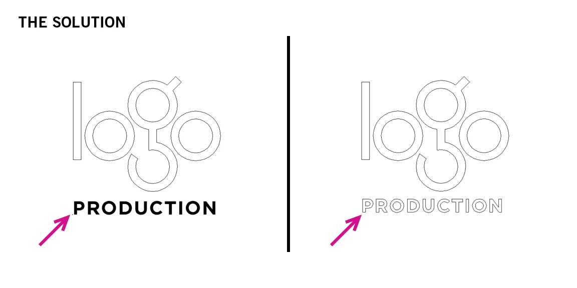
The solution is to turn the font into outlines. That way it is no longer type. It becomes artwork. In Adobe Illustrator, select the type and “Create Outlines.” You can see the change when viewing in Outline Mode.
Your logo file could end up in the hands of many vendors and other designers. This second step is done to protect your design from someone accidentally making an unwanted adjustment to it.

Let’s say you’ve used a stroke (a line or rule) as an element in your logo design. You’ve spent time adjusting it to the perfect thickness – let’s say 12 points. The problem is if you pass the file off to someone else, they may enlarge or reduce the art to fit their needs. What could happen is the artwork would change in size but the stroke would stay the same 12-point thickness. Your logo could end up looking very different than intended.
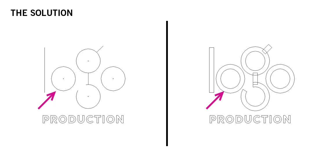
The solution is to select the strokes in Adobe Illustrator and “Outline Stroke.” The stroke becomes a shape that will now adjust in size proportionately. Again, this is visible in Outline Mode.
I think there is some designers who haven’t thought through all of the possible ways their logo might be used. This is the case with the third step.

When producing logo art in Adobe Illustrator, the art board (background) is white. Because of that some designers will use white shapes to cover up parts of the design as a way to erase areas they want to disappear. This is fine if the logo will only ever be used on a white background. The problem is when the final logo is applied over a different colored background. Those white shapes appear! I've seen this many times in print and on video.

The solution is to delete the white shapes as well as the areas they are meant to erase. In Illustrator, select both the white shape and the shape it is covering. Then, using the Pathfinder tool, click on “Minus Front.” Now the white shape AND the area it covered are removed.
And there you have it – three simple steps to help insure the production of your logo is complete and ready to pass along to your client.